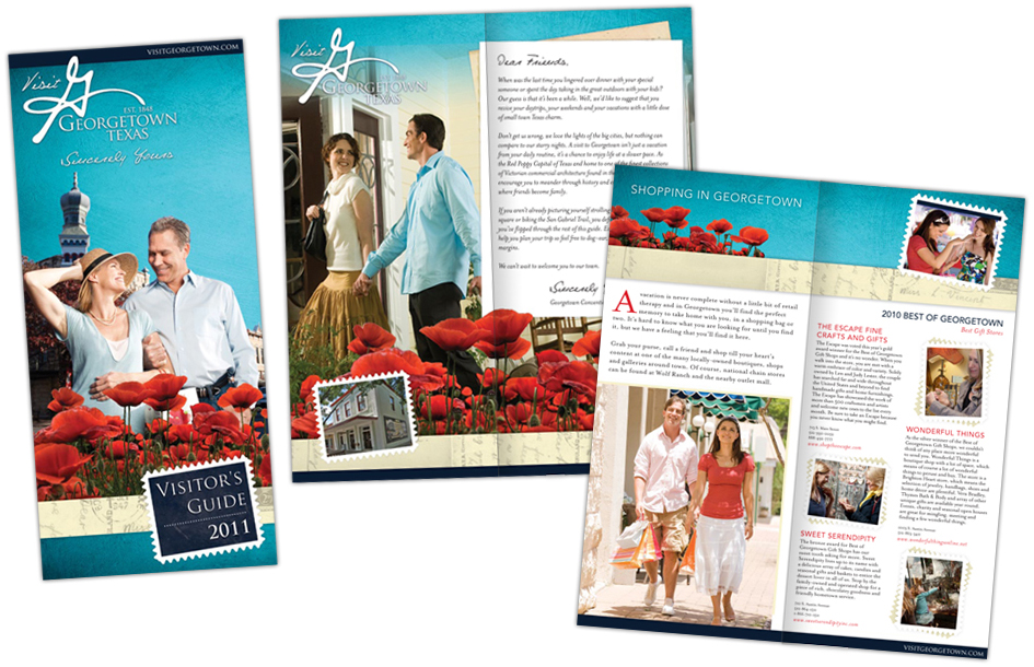
Fancy a visit to Georgetown, TX? Check out the brochure…
Traveling is one of our favorite pastimes here at Rhyme & Reason Design, Inc. If you know us personally, or have read through some of the back pages of our blog, you will have realized that we hop a plane in a blink of an eye. So what better client to have the opportunity to work with than a visitors bureau? Right up our alley. Well back in November, we received a call from the Georgetown, Texas Convention and Visitors Bureau informing us that we won the bid to re-design their Visitor’s Guide brochure and website. The only minor detail about winning such a great project was coming up with the perfect design and messaging for a city we’d never stepped foot in.
Luckily, Cari Miller, Georgetown’s Tourism Manger did an incredible job as our virtual tour guide throughout the whole process. From start to finish, she unlocked the city and introduced us to some of its incredible residents.
Due to a tight printing deadline, we started with the brochure. Designing for places we haven’t been is no problem; with enough research and immersion you can create a picture in your mind. But what about writing the contents of an entire visitor’s brochure? Well let’s just say, I now know a heck of a lot about the Red Poppy capital of Texas. Seriously, ask me anything. Who’s the city named after? Easy, George Washington Glasscock. Try another. When’s the Red Poppy Festival? April 16th and 17th. Ok seriously give me a tough one. Where’s the best place to eat? Ok now that’s just not fair because there are more than 100 restaurants to choose from and as they tell me, every one of them is finger licking good. Although, there are three – Wildfire, Dos Salsas and Monument Café – that received the award for best overall restaurant and after writing about them, I have a strong urge to not just book a ticket but, also a reservation or two.
Although, I have become a bit of a walking Wikipedia post for Georgetown, the brochure still had to go through several rounds of revisions. Don’t worry, we didn’t miss the boat with the design or the copy, it just so happens in our world, revisions happen regularly. Not to mention, Cari and her team know a lot more about their small town Mayberry than we do. Once our team completed the revisions and the brochure received final approval, we packaged up the files and sent it off to the printer. Now printing is a nerve-wracking experience, no matter how great the printer is or how many times you’ve proofed a file, things can sometimes go wrong. So from the moment we send a file off to the moment we receive it back, we often sit holding our breath. Ok perhaps I exaggerated, there’s no way we could go without oxygen for a week. Well seven days after we clicked send, we were able to breath easily, because one fantastic looking brochure appeared in the mail. Yes I may be biased, but I am so proud of this brochure that it has taken up residence as the focal point of my coffee table.
In order not to create a novel out of one blog post, I’m going to make you wait with baited breath to learn more about the Georgetown website… To be continued…


