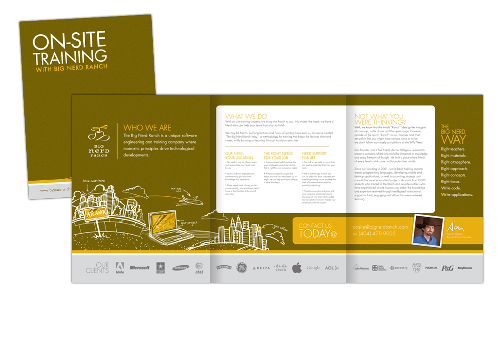
The Making of a Brochure
You have been a loyal reader of this here blog for nearly three years now and I must thank you many times over for your interest in reading my ramblings. Now here’s my question to you, after all this time of reading about the cool designs we’ve created and the fun clients we’ve worked with have you ever wondered how we come up with the finished products? I know I do sometimes. Well guess what? I’m going to let you in on a little secret, that’s right, I’m going to tell you how we created our newest Big Nerd Ranch masterpiece – the Onsite brochure.
Our partners at Big Nerd Ranch offer some pretty cool services from developing iPhone and iPad applications to hosting weeklong technology classes. Recently, they came to us with the idea of creating a brochure that focuses on their onsite courses. Onsite courses enable small and large corporations to provide up-to-date training to their technology staff without having to send their entire team out of town for training. The pros, the company gets to save money, educate their team members and pretty much have all their problems solved, well at least the Nerd-friendly technology ones. The cons, there are none. Sounds pretty great, right? Now just how do you tell the decision makers about this idea in a manner that isn’t overwhelming? Well make a fun, self-mailing brochure of course!
So that was the idea, now how did we make it a reality? Well for starters, I gathered up an array of notes, bullet points and anecdotes from the Big Nerd team and compiled the first draft of copy. Not as easy of a task as you would think. In fact, developing intelligent, fun, professional, yet not too professional technology-based copy may be my greatest feat to date. Following a couple rounds of revisions, a crash course in programming languages (in case you were wondering, Cocoa is not just a chocolatey beverage for cold days) and several dictionary visits the copy was ready for a design. That’s right, in design, the copy comes first, just like the horse before the cart.
With copy in hand, it was up to Karen to develop a piece that stayed true to Big Nerd’s brand, but extend it a bit further. Knowing that the BNR team loves their illustrations and drawings, Karen decided to give those whimsical touches some legs and some airplane wings. Wait, did I just say wings? Yes no stuttering here, Karen, our amazing creative director not only is a whiz with InDesign but, unlike my sad excuse for stick figures, she has a knack for hand drawn illustrations. Ok so I could continue to talk about the illustrations, but I am going to let them speak for themselves. Below is the process (in drawings) that Karen went through to design the look of the Onsite brochure.

See aren’t you glad you read through all of that to get to the cool pictures Stay tuned for more designs to come, who knows the next one could be your project.


