Facebook Timeline, designing for visual engagement

Woohoo! We survived the transition to Timeline, did you? On March 30th, Facebook introduced businesses the world over to their new social layout. Surprisingly, it was met with a high level of positive feedback, unlike the personal timeline profiles. In a previous post, I spoke in detail about the value–adding changes that Timeline was bringing to the table, providing examples of big brands who had the inside scoop on the layout before the rest of the population.
Here, I’ll try to explain in a bit more detail how you as a start-up, a small business or large organization can utilize Timeline to promote who you are and what you stand for, as well as show off some of our hard work.
Cover Photo
Having worked with Alpha Sigma Alpha during the past few years on developing their brand image and integrating it throughout all facets of their organization, we had their cover photo design in mind before they even asked us to assist. If you have visited the sorority’s website, www.AlphaSigmaAlpha.org, you will have noticed a distinct look and feel. By recreating the same visual aesthetic in their cover imagery, we reinforced the brand while offering a vibrant welcome to the sorority’s wall.
By creating a cover photo that mirrors your brand, the transition from one online platform to another becomes seamless. Cover photos should instantly connect with your audience. You’ll notice that the Alpha Sigma Alpha photo integrates both collegiate and alumnae women in the graphic, while promoting their tagline, creating engagement throughout all levels of their sisterhood, not simply the younger or older demographic.

Profile Photo
For many fans, the only thing they will ever see of your timeline is your profile picture. Why, you ask? Because studies have shown that often times fans will only read the information that is pushed to their wall. With that in mind, it is essential that your profile picture promotes your company first and integrates into the cover photo area second. If your profile picture is just a pretty element in your overall cover graphic, it will not successfully create brand awareness. The profile photo should be an obvious brand element, either the name of your company as shown in the Big Nerd Ranch example or an identifying brand mark such as the Moffitt Cancer Center “M”.

Iconography
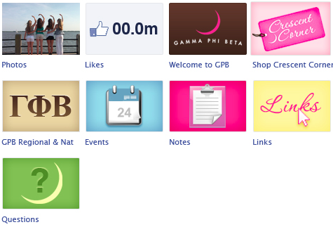
The application icons are great tools for extending your brand further. The buttons may be small in size, but including imagery that complements your brand image and appeals to a fans love of visual content helps encourage visitors to actually click on the applications. The grayish default versions are toned down and are easily ignored, whereas bright, colorful branded versions like Gamma Phi Beta’s demand attention.

Timeline Content
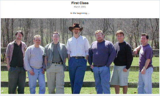
Timeline was designed to share happenings in a very big picture, chronological manner. For businesses to successfully make the most of the layout they must be willing to share at a more personal level, encouraging fans to take a vested interest in how the company came to be and the events that made it what it is today. Reading is often too time-consuming, but a giant picture is arresting and makes the point quickly. Incorporating a visual, denoting important moments in history and becoming human is what will divide the active timelines from those who are lost in time. Big Nerd Ranch does a great job of denoting the big moments in their path to “Achieving Nerdvana” from their founding to their first ever class and the future home of the Ranch.


