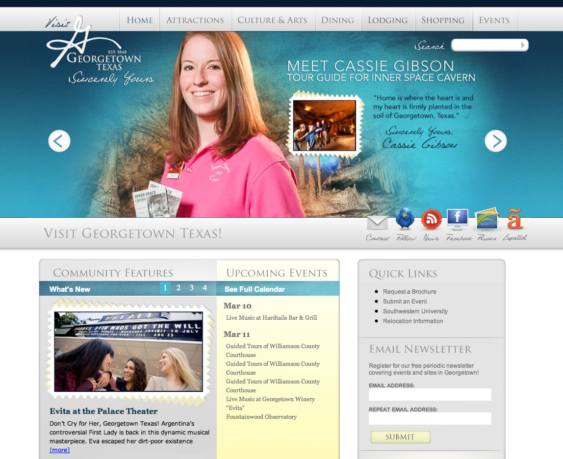
Visit our website design, visit their town, visitgeorgetown.org
Last week I talked at length about designing and writing a brochure for the City of Georgetown, TX. Now there is truly something wonderful about holding a tangible piece of marketing collateral in your hand, but what is often more mesmerizing to me is watching a website come to life. Between the Visitor’s Guide brochure and website, I’m not exactly sure which one I am more infatuated with at the moment. Yes the brochure, once it’s lived out it’s time on the coffee table might be framed (did I mention how proud I am of that guide?), but what about the site? It might as well be a work of art living on the web for the whole world to enjoy. Ok maybe not the whole world (although they could), but at least several thousand visitors a year.
Before you visit the site, let me fill you on the design and development side of things.
When we signed, sealed and delivered the RFP, we included a mock-up of a possible website home page. Little did we know that Georgetown would love that design so much that they would request not see any further directions. When I first spoke with Cari, Georgetown’s Tourism Manager, she informed me that the design we included in our proposal was so perfect that the city insisted on having that design and that design only. I was a bit shocked to say the least, not because I didn’t agree with the decision, in fact Karen created a truly incredible direction that I hoped would see the glow of the Internet one day, but more because usually a round or two of revisions precede final decisions. Not this time. Cari loved it, the city officials loved it and we loved it and that was that. Now keep in mind that we only designed the home page, so we weren’t off the hook that easily, there were still several other unique sub page styles to create. However, with the home page design complete and the brochure look and feel established, Karen was able to seamlessly integrate all the elements to create sub pages that complement the entire package.
Typically programming and development follows the design process, but this time it was occurring simultaneously to the design phase. How is that possible you ask? Completely possible and extremely easy to do when you are partnering with a programmer such as, the City of Georgetown’s internal programming whiz Erin McDonald. Erin started laying the back-end code the minute Karen finished packaging up the home page files and didn’t stop until every image was perfectly placed and the weather widget was warmly glowing with sunny icons at the bottom of the home page.
Due to the fact that the site is targeting visitors it must act as a resource for travelers and therefore it includes a few unique bells and whistles. First, there’s that fun little weather widget that I mentioned earlier, followed by functionality that allows you to book a room directly through the site and then of course a regularly updated calendar of events. All three are great tools for the ever more prominent web-savvy traveler.
Alright, before I overwhelm you with details, why don’t you check the site out for yourself. Oh and if you want to book a trip, let me know because I’m coming with you. visit.georgetown.com


