
The Building Blocks of a Website

When building a website, it helps to have a step-by-step process. Ours is pretty simple: start with research and immersion to fully understand your current site’s strengths and weaknesses, map out a site plan that maximizes those strengths and minimizes (or better yet, eliminates) said weaknesses, create wireframes for your top pages, craft some beautiful designs, develop your new site and… launch! Okay, that might be over-simplifying it, but the spirit is there. While each of these steps is just as important as the last, let’s take a special focus on wireframing and how approaching this step with strategy makes for a better backend site for your team.
But first, a quick refresher on some web words:
Site Plan: A visual layout that maps out where your web pages exist in relation to one another.
Wireframes: The visual layout of a single web page without the use of brand colors, fonts, photos, etc.
Content: This is all the delightful text, photos and links that make your site unique.
Top-Level Pages: These are the pages that are located in your top navigation bar, including your homepage.
Atypical Pages: These are pages that may need special attention in wireframing and designing because they are unique.
CMS: Short for Content Management System, this is a platform that allows you to access and edit your site’s content in an interface rather than manually having to code it (ex. WordPress, Drupal, Joomla).
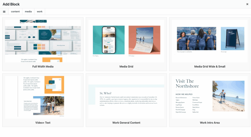
Now that you’ve brushed up on your vocabulary, I’d like to introduce you to a new phrase: block components.
Yep, quite literally, the building blocks of your website’s pages. These block components are small sections of content that can be applied throughout your new site. When our team begins drafting wireframes for your new site, we identify common block components that can be used throughout the rest of the site. Here are some visual examples of common block styles in the wiring stage and how we can further refine them to fit your brand.
- Call-To-Action Block: This example includes a headline to grab attention to a page you want to drive traffic towards, some space for copy explaining that page, a button to direct users to that page and a photo.

- Show/Hide Block: While most commonly used for FAQs, a show and hide block is a great way to condense a lot of content into bite-sized information.

If these blocks sound restrictive, they are surprisingly anything but.
Each block component is coded to give you the ability to customize by swapping between your brand colors, switching between left-aligned and right-aligned and more.
Here are some examples of all the many ways that the exact same block could appear on a site, thanks to this customization:
So why do these make your life easier? Two reasons.
First, by determining the blocks that work best for your site’s content and objectives, our team can understand what your entire site looks like by only spending time wiring around 10-16 of them–specifically, your top-level and atypical pages, as those are often the most unique. From there, we can identify how the content you’ve provided for say, a third-tier page could fit into any of the blocks we’ve designed and plug and play. This strategy saves your timeline and your budget.
Secondly, when our developer builds your site in WordPress, he builds each of these blocks with your brand colors and fonts already defaulted to them. You don’t have to mess with adding your brand assets each and every time, they’re already there. One day, after launch, you might decide that you need to add a page to your site. Instead of having to ask a developer to code it from scratch, you can add your content to any of these blocks, click “publish” and voila! New page added and now you have a website that is modern and maintainable.