Top Fraternity and Sorority Website Designs of 2025

When you are in the business of style forecasting and trendsetting like we are, you tend to make staying abreast of the Joneses, or in this case the Zetas and the Betas, a priority. With rebrands and technology updates occurring more frequently, we’ve set our sights on, well, sites. And boy, have we been impressed with the latest and greatest fraternity and sorority web designs. Though we’ve had the pleasure of working on a few of these ourselves, there’s definitely a hefty dose of design inspiration to gain from the Greek community. So have a browse through our top 10 favorite Greek-letter sites and let us know your thoughts.
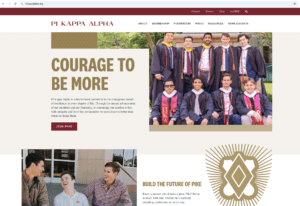
Pi Kappa Alpha
We might be biased on this one, but it’s a favorite of ours, and not just because the site showcases the Fraternity’s new brand from header to footer. Well-organized navigation and eye-catching CTAs seamlessly direct users, while stunning photography and graphics make the journey as nice to look at as the destination. Details such as a sticky navigation bar, animated quick facts and an integrated social feed show that PIKE really does have the Courage to Be More, especially in design.
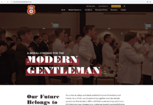
Kappa Alpha Order*
A fan favorite, and not just for the gorgeous ambient video header. KA’s site thoughtfully balances the traditional aesthetics of the Order while addressing modern audiences. A strong vertical homepage scroll uses engaging headers and images to highlight the Order’s six core values. The end result is a values-driven website that reads cool, not stuffy.
🏆 FCA website award winner: 2024
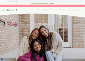
Delta Zeta
High-quality photography can turn a great site into an amazing one, and Delta Zeta does that very well. The long scroll on the home page paces information out so that each tidbit of content can be in its own spotlight. Additionally, graphics that draw on as you scroll and a gradient photo treatment are thoughtful embellishments to the brand.
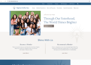
Sigma Delta Tau*
Launched alongside Sigma Delta Tau’s rebrand, their new website offers a digital experience that’s both stunning and seamless. With easy-to-navigate pages that radiate personality, the site is sprinkled with branded touches—from shimmering gold buttons to subtle animation effects. Every scroll reveals something intentional and beautiful, making this new website one that truly shines.
Kappa Delta
While the homepage is a stunning expression of KD sisterhood, we just can’t help wanting to explore the depths of secondary and tertiary pages on this site. Each page seems to hold its own surprise with playful image containers, chic background color changes and exciting graphic elements to boot.
🏆 FCA website award winner: 2023
Phi Delta Theta
If any Greek site gives a strong first impression, it’s Phi Delt. The ambient video, the animations when you scroll, the show-stopping photography – every detail is bold. Phi Delt’s clever use of white space helps to strike that balance between making a visual statement without becoming overwhelming.
🏆 FCA website award winner: 2024
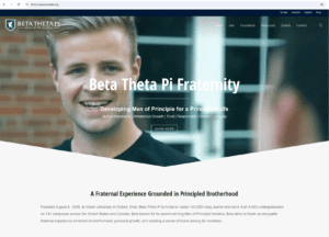
Beta Theta Pi
When we ask our Greek website clients which sites they admire most, Beta’s name is always dropped. And it doesn’t take much to see why: ambient footage in the header, purposeful messaging and an interactive navigation experience that encourages discovery, just to name a few. Beta’s website captures the entire fraternal experience – it’s no wonder prospective members want to join and alumni members want to come back.
Alpha Phi
Welcoming from the first scroll, Alpha Phi’s site is sleek, confident and easy to navigate. Strong visuals and dynamic content tell the user exactly what the sisterhood stands for, and a columned full-page menu makes it easy for them to dig deeper. We love the variety in photos, including both collegiate members and alumnae of all ages, showcasing that this sisterhood really isn’t just four years, it’s for life.
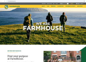
FarmHouse Fraternity
Simplicity can make a big impact and FarmHouse pulls it off. The resulting digital home is sturdy, smart and straight to the point. Forget the fluff: bold colors and meaningful copy on the homepage tell you all you need to know: FarmHouse is that guy.
🏆 FCA website award winner: 2023
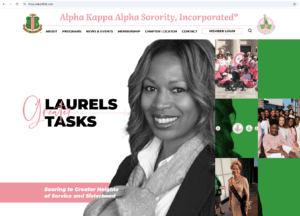
Alpha Kappa Alpha
AKA’s site does a wonderful job of showing how tradition and innovation can go hand in hand. Their dynamic animations pair well with thoughtful content. The end result is a visually engaging and informative experience. Bonus: the primary navigation bar hides as you scroll (and reveals itself with an easy scroll upwards) so that you can focus on the information that you need.
Tri Delta*
To round out our list, we have Tri Delta’s site: it’s confident, clean and incredibly well-paced. The navigation is simple yet strategic, with clearly defined paths for every type of visitor. With thoughtful messaging and just the right amount of motion to keep things engaging, it’s quite a powerhouse and definitely worth a scroll.
* Indicates an R&R original


