Big Nerd’s Big Site

If you are a Rhyme & Reason Design fan, you’ve probably heard us talk about Big Nerd Ranch a time or 10. Well we have been lucky enough to work with the coolest Nerds around for several years and during that time, we have helped create a cohesive brand message that seamlessly translates across digital and traditional marketing materials.
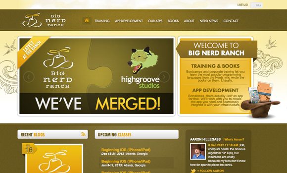
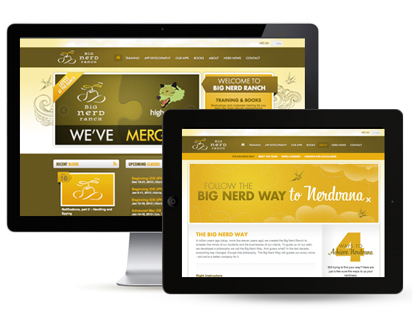
Recently, we had the unique opportunity to redesign the Big Nerd Ranch website. I say unique, not simply because they have such a playful aesthetic, more because we designed the site we were redesigning and its amazing to see the extent that technology has shifted in a few short years.
For starters, the old site was built using Flash as a central feature – GASP. But wait, keep in mind there was a time when Flash was what all the cool kids were doing. Alas, that is no longer true, especially for a company dealing heavily with the mobile app world. Big Nerd Ranch had also seen an evolution in their services, growing from a handful of nerds to over 40 strong. Another big shift was that the socialization of the world was in its infancy back when we created the first site, Twitter had only begun to share what the world was eating for lunch.
Obviously, we kicked Flash to the curb first, that was the easy. The site architecture was where things started to get sticky. In the time since the original site launched, Big Nerd Ranch had written new books, started teaching Android classes (iOS tears were shed), opened Ranches around the globe (Amsterdam, anyone?), grew their services to include corporate training, software development and a set of new proprietary apps for themselves and a who’s who of clients. Oh, and they hired dozens of new Nerds and built a new Ranch to house them. And if that wasn’t enough, they merged with Atlanta-based Ruby on Rails agency Highgroove and doubled their Nerd strength. Phew, they’ve been busy.
Now the question remained, how were we going to capture everything in a very user-friendly and engaging website. It was a question we pondered over many a sticky note brainstorm. In the end, we kept the content high-level and used imagery and iconography to tell the story in a creative way. The site now calls out the multiple social media platforms where you can find and interact with the Nerds and even has real-time ticker denoting new fans and followers. Nerd aficionados can sign up for the Ranch Report on any page of the site or stay up to date reading articles in their fancy new blog.
Now that the new site is live, it’s hard to think of it looking any other way. Take a gander at it yourself and when you’re there congratulate them on their merger with Highgroove Studios! Oh and don’t worry, the new site isn’t going anywhere, it just might get a little groovier.


