The Client
The Round Rock Public Library System is a gateway to the community. They are committed to providing individuals, families and businesses with an opportunity to expand their knowledge, encourage personal growth and enhance their quality of life in our dynamic and changing world. The library offers a broad and relevant collection to promote lifelong reading and learning, and uses current technology to increase access to information resources.
The Sticky Wicket
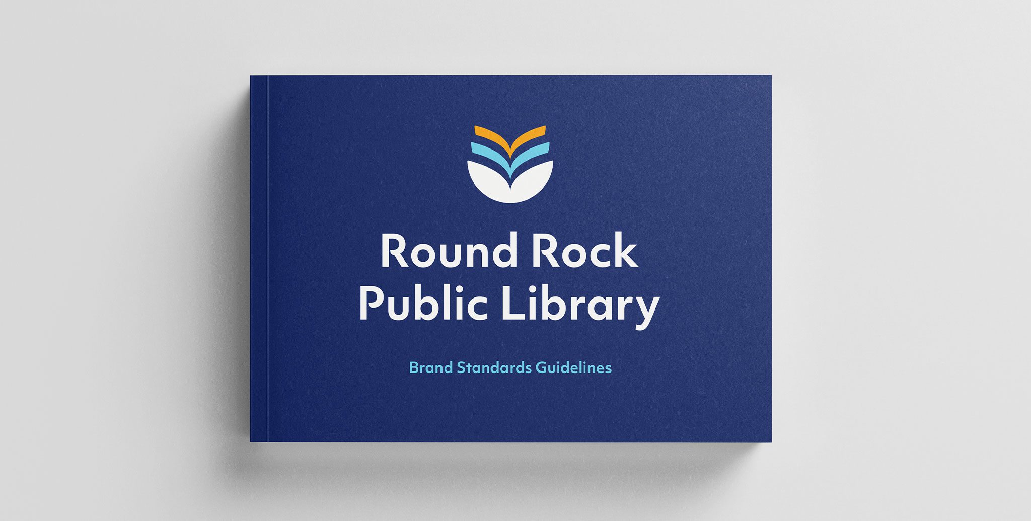
Amidst the construction of a new building, Round Rock Public Library seized the opportunity to build a shiny new brand to match. Enter R&R. Through in-depth discovery sessions, we learned that the library target market could not be easily defined by one audience or another. Instead, it is a market made up of diverse individuals from every walk of life and culture, all seeking something different. With that in mind, the new logo-mark would need to be inclusive and approachable to all.
The Awesome Sauce
A sophisticated, yet unpretentious, new brand aesthetic was established that has been welcomed by the community. Visual easter eggs nod to the growth of Round Rock, Texas and to the library building itself. The color palette was crafted with the city’s logo in mind, knowing that these two marks will frequently be presented in tandem. And the many layers of this mark tell countless stories. Each viewer can interpret it differently and take away something new, reflective of their uniquely personal experience with the Round Rock Library.