Alpha Delta Pi’s Foundation – Supporting a Sisterhood
Here at Rhyme & Reason Design, we love the Greek community. Not only are they amazing clients, but they are organizations that truly stand for something and are dedicated to the betterment of the world around them.
For those of you like myself who did not pledge a sorority or fraternity during college, you may not be aware that each house has an overarching national headquarters where business is run on par with many of the Fortune 500 companies of the world. Not only will you find a whirring financial department and dedicated marketing staff, but also a Foundation committed to the continual support and maintenance of philanthropic, educational and leadership efforts for collegians and alumnae.
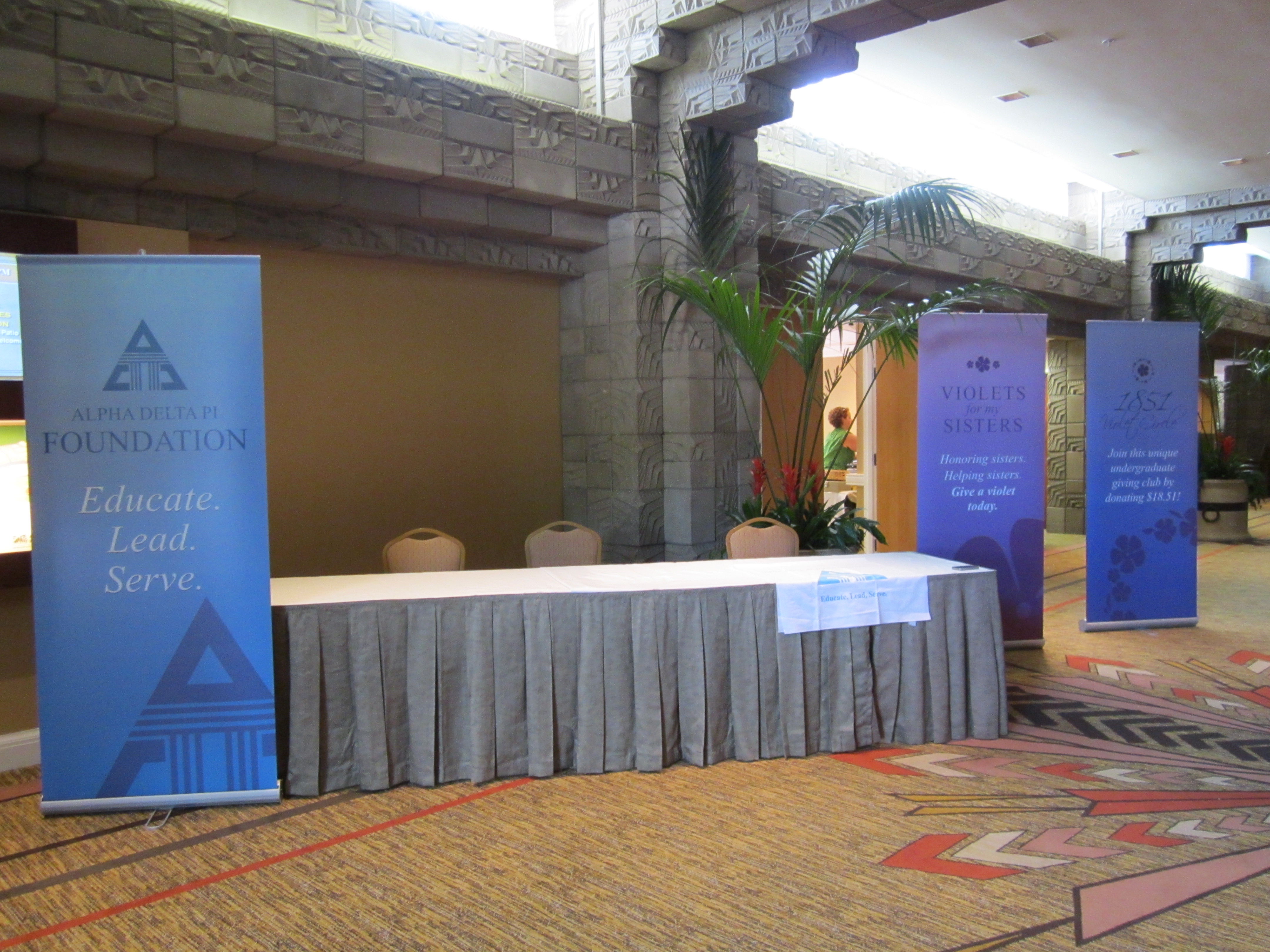
Recently, the Alpha Delta Pi Foundation came to us requesting our help in creating three unique banners for their upcoming national convention. Quick tidbit, national conventions are biennial events organized to bring members of the organization together to pass bi-laws, vote on new national council members, educate members and celebrate sisterhood (or brotherhood in the case of fraternities). The banners we were asked to design, promoted the Foundation and its mission as a whole, as well as two initiatives, the Violet Circle and Violets for My Sister. The Violet Circle is an individual undergraduate giving program named in honor of ADPi’s founding in 1851, while creating and acknowledging current chapter members who contribute $18.51 or more. Violets for My Sister is a program to honor and aid sisters, with proceeds benefitting an emergency grant fund for Alpha Delta Pi alumnae.
It was necessary that all three banners promote a separate message, but still complement one another in visual appearance. Utilizing a monochromatic color scheme, we were able to develop three unique banners that seamlessly flowed with one another. The copy was kept short and sweet to ensure the busy collegians and alumnae received the message without having to stop and read an entire novel. Simple yet powerful graphics were added to again quickly convey the message.
As the agency, we happen to be partial to our work and thought the final product looked amazing (and so did the Foundation’s staff). However, the true testament of our creative chops was the feedback we received from convention-goers. Turns out, we aren’t the only ones who thought the clean, modern signs were pretty great – sisters and alumnae alike complimented the designs and even asked to take pictures with the BANNERS! Seriously, you know you’ve done well when your audience wants a lasting (ok digital) memory of a design you created.


