R&R whipped up a sweet logo for LoLo’s Cupcakes

What’s not to love about cupcakes?
Yeah we couldn’t think of anything either, which is exactly why we practically asked to lick the spoon when Lori of LoLo’s Cupcakes called to enlist our help with branding her cupcakery.
Branding a new business with a logo is a defining moment in the life of a company as well as the life of an owner. It requires so much more than simply saying, “I like pink”. It’s a strategic process that begins with a deep understanding of the business, the industry, the competition and last but certainly not least, the consumers.
Research and Immersion
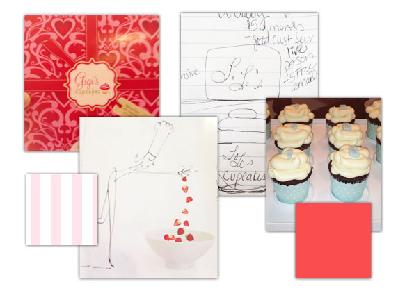
For the LoLo cupcake brand, we began with an in-person discovery session. During the session, we discussed her goals and objectives for the business, her perceived competitors and her ideal customer. We also explored her emotional connection to her vision and her more personal aesthetic opinions. We covered a great deal of ground in the initial meeting, leaving with a notebook filled with cupcake photos, aspirational designs and a personal note from Lori expressing why she wanted to start the business. Building on the information gathered during the meeting, we spent sometime researching the cupcake industry our selves, from Atlanta-based shops to national chains we got our fill of sweet sites. To complete the immersion phase, a creative brief was developed utilizing the notes from Lori and our own research. The creative brief is the written document that summarizes the project for the creative team; essentially it is the blueprint for the design.Design exploration and creative concepting
An approval of the creative brief signifies the end of the research and immersion phase and the beginning of the design phase. Taking into account Lori’s personal design preferences, examples of aspirational design and competitor’s marks we concepted a diverse selection of logo ideations. Although ideations are great, they aren’t client ready designs, so we spent time fine-tuning and tweaking our top three designs. When at last we could not alter color, font or layout any more, we set up a time to present the designs to Lori.
Fine-tuning, the revision process
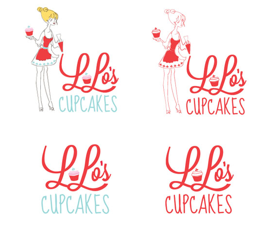
The three designs successfully conveyed the message of loving, French cupcakery, but one in particular took the cake, or the cupcake that is. During the presentation and even after a few days of personal review, the mark that most captured Lori’s heart was one with a sketch of a baker girl. However, that’s not to say that the two other designs were of no use, in fact there were several elements from each design that Lori wanted to infuse into her chosen mark. We carefully and thoughtfully refined the mark based on her feedback.
Logo library and usage guidelines
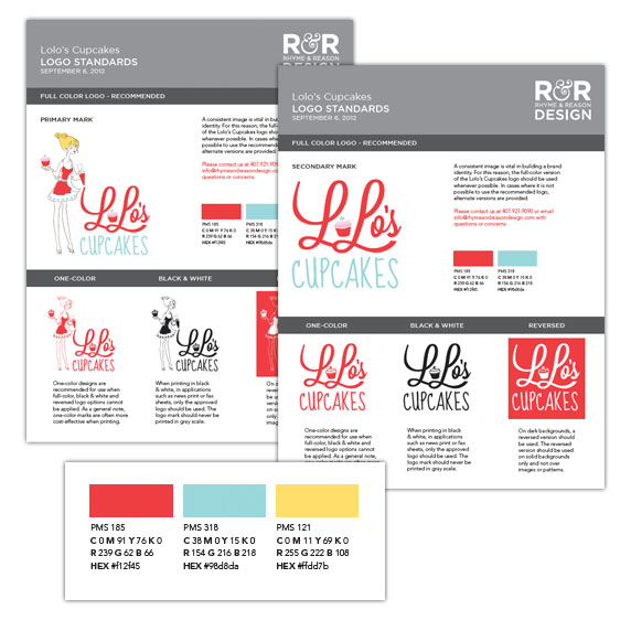
With a final stamp of approval from Lori, we packaged up the LoLo’s cupcake logo, providing Lori with a variety of logo file types (eps, jpg, pdf), color options (black and white, full color, one color and reversed) and a full page usage document denoting the exact colors and fonts used for her very unique mark.
Lori had a definitive vision when the project began and it was her understanding of her goals that helped us to easily navigate the branding process. Congratulations Lori on your new logo and your new adventure. To all of you looking to follow in Lori’s footsteps, take some time to think about your business, introspection not only helps you but it also helps any design team you may work with.


