
5 Key Elements of a Successful CVB Home Page
Since stay-at-home orders were implemented, we’ve all had a lot more Internet time on our hands. For some, the vastness of the World Wide Web has given them the opportunity to perfect their TikTok dance moves, while others have found solace in a myriad of memes.
Yet, for those of us that have a love for wanderlust, we’ve spent a good bit of time letting our thirst for travel lead us up virtual mountain paths and across great plains. We’ve crafted bucket lists, mapped road trips and planned our “freedom trips,” aka our first vacation post-pandemic.
Through all of our online explorations for offline adventures, we routinely found ourselves on Convention & Visitors Bureau (CVB) websites. Of course, here at R&R, we’ve been partnering with CVBs for the last decade to better tell their stories. But, that’s not the only reason why we scrolled their digital content during our downtime. These sites are incredible tools for discovering all there is to do, see, eat and enjoy in a destination. When you dig in, you can find blogs for affordable activities, kid-friendly itineraries and live-like-a-local tips.
During our browsing, we found that there are five key elements that make for a great user experience on a Convention & Visitors Bureau home page. We’ve included the five elements below, not in order of priority, but simply as the page flows from top to bottom.
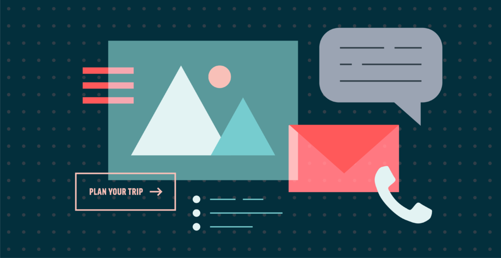
1. Obvious navigation structure
This might be, well obvious, but having an easy-to-understand and easy-to-find main navigation and secondary navigation structure goes a long way to ensuring that an end user doesn’t leave before they even arrive.
The target markets for most CVB sites want to gain information for a trip, either well in advance of their vacation or in the exact moment that they’re looking for dinner in your destination.
Which means, they both need the ability to find what they are seeking as quickly and seamlessly as possible.
Your navigation is not the place to get overly creative. It needs to be ADA compliant, work well on desktops and mobile devices, and the actual words used should be universally understood – i.e. Dining translates better than, say, Delish.
2. Place-making imagery
Here’s the thing, when someone is searching the Internet for destinations to dream about, they are often looking for visual inspiration. The home page of your CVB website is your chance to serve them just that.
- Highlight your city’s vast vistas or languid lakes in the header banner.
- Sprinkle in imagery of ambling paths for outdoor features along the way.
- If you are promoting your social feed, make sure the photos encourage visitors to imagine themselves there. i. curate a visually-engaging, diverse gallery of photos that encourage visitors to want to learn more and see more.
3. Brief introduction
Once you’ve visually engaged the visitor with your photos of scrollable squares and vibrant street art, it’s time to offer them a little insight into what your area is all about. But before you start writing the great American novel, remember that web users realistically read only about 20% of the text on a page (if you’ve made it this far into this blog, high five). Which means, you barely have their attention after they’ve ogled that photo.
Here’s the deal, create content that is:
- Short – no more than five sentences in length
- Valuable – provides useful information
- On brand – establishes your organization’s tone and voice
4. One to three clear calls to action (Learn more, sign up, plan)
Since no one is reading, you’ll need to make sure that you are giving your visitor pretty clear directions on what you want them to do. Additionally, not everything can be a priority so you’ll need to define a primary objective, and understand your secondary and tertiary objectives.
For CVB sites, you may determine that your main goal is to grow your email list or perhaps it’s to increase the number of users who visit a specific itinerary page. Whatever you decide is your measurement of success, be sure to make that call to action the most obvious on the page. In other words, add it towards the top of the page, make it visually unique (but on brand) and ask for the action.
5. Easy-to-find contact information
Let’s be honest, we’ve all learned through our own web browsing that contact information is typically found in the footer of a site and/or on a specific easy-to-find contact page. With that said, it’s not simply a successful “home-page” element, but an element that is necessary to the success of the entire site. Therefore, when you are thinking about the footer be sure to include your CVB’s primary phone number, general email address and if you do have a visitor’s center, the physical address of that center.
Bonus: Itineraries
If you can check all of the above off your list, your CVB’s home page is doing awesome and you deserve a cupcake toast. However, if you want to go for the extra brownie points, we’d suggest adding a section that highlights an itinerary or two.
We’ve heard through anecdotal research that travel planners – those who have the job title and those who just enjoy the hobby – find itineraries to be the most useful resource of a CVB site. Why? Because most individuals planning trips are looking for reliable insider tips, credible local details and targeted options. Which means, those itineraries that your team has written about the best affordable weekend plans for a family of four check every box for the discerning planner.