
Rebranding A Nonprofit – 5 Key Things
First of all, what is a rebrand? According to the ever-so-insightful Wikipedia:
“Rebranding is a marketing strategy in which a new name, term, symbol, design, concept or combination thereof is created for an established brand with the intention of developing a new, differentiated identity in the minds of consumers, investors, competitors and other stakeholders. Often, this involves radical changes to a brand’s logo, name, legal names, image, marketing strategy and advertising themes.”
Ok, now that we have established what it is, I want to take a moment to proclaim that I absolutely *love* when I get to work on a rebranding project. For me, it’s the “full package” of all my favorite things – design (of course), problem solving, learning and relationship-building, all of which come together to help others succeed. Fortunately, I have had the pleasure of working on quite a few rebrands over the years, especially within the nonprofit realm.
As I eclipse my five-year workiversary at R&R (whoa–time flies, right?!), I have been reflecting on what we have accomplished over the years, and what I have learned from it all. Spoiler: it’s a lot. And because sharing is caring, I wanted to share some of those nuggets of wisdom.
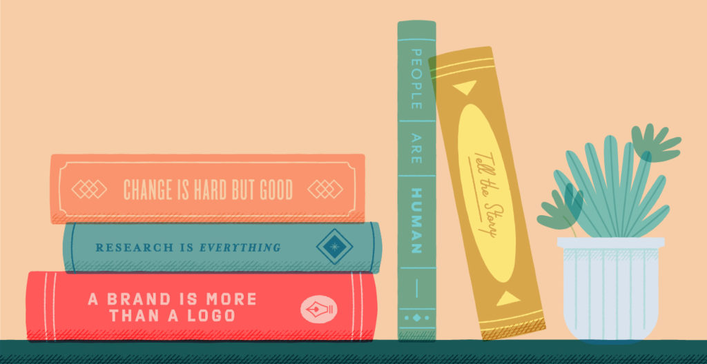
Here are 5 key things I’ve learned from my past 5 years of rebranding nonprofits:
1. A brand is more than a logo.
I don’t know who needs to hear this, but a brand is more than a logo! The truth is, a logo by itself—even a really good one–doesn’t do all that much on its own … and we shouldn’t expect it to. A logo is a small-but-mighty tool in the marketing toolbox. It’s an excellent start, and extremely valuable, but it isn’t the only thing that tells a brand story. There are so many other pieces that come together to create a brand experience–supplemental design materials, strategy and messaging all aid in creating a holistic experience.
A logo is a graphic device, whereas a brand is a whole essence, a feeling. Think about Disney, for example. The logomark is a cool whimsical script that is unique, yes, but is that all that comes to mind when you think of Disney? For me, I think of the castle graphic, the music at the beginning of every movie, Mickey ears and the enchanting experience of walking through their theme parks. This isn’t something that magically happened after they dropped the logo on a sign. It took care, years of effort and even a little bravery to do things differently. You don’t achieve that simply with a logo mark, you’ve got to put in the work.
2. Research is everything.
Research is where I get my best design inspiration. Here’s why: The internet is chock-full of cool, trendy brands. It’s so easy to fall down a design rabbit hole and think, “Hey, that’s fun, I bet I can make that work for my client project.” But if you’re not careful, you can run into the following big issues:
- It isn’t timeless– Many nonprofit brands need to last a long time, so following the cool trends of today may lead to a brand that isn’t usable tomorrow. With the way technology has evolved in the past 10 years, it’s hard to know what will work in the future, but if a brand is crafted with the client’s history, core values and/or future initiatives in mind, it’s more likely to stand the test of time than something that just looks cool right now.
- It isn’t special– If it wasn’t created to tell that particular client’s story, then it isn’t truly *them*. Research leads us to the knowledge of what makes the client different and special and what makes them different is their superpower– honing in on that will lead to an informed design that is especially theirs. When I’m working on a brand, I often ask myself, “Could anyone else pick this logo up and use it for themselves?”
It’s totally fine to learn from and be inspired by others, but following the research leads to thoughtful design solutions that are truly unique for our clients. Without this research, it’s really just a shot in the dark.
3. Change is hard (but good).
We can all agree that change is hard. But businesses are not static– they will grow, change and evolve over time. The same thing can be said about their brands. What was important when a nonprofit opened its doors may not be a primary focus for them after 20 years, and that’s 100% okay. The world we live in changes DAILY, and in order to stay relevant, the most successful brands are those that have learned to be nimble.
Some nonprofits that we’ve rebranded had their logos since before the internet (think about that for a minute), so they didn’t have to consider the way their brand looked on a smartphone or in an Instagram avatar when they signed off on it. Now, even though their brand is established and has a lot of history, it could be holding them back. Sometimes what is in the best interest of moving forward is letting go a little. Again, going back to research, this is why it is essential to really dive into what is important to hold on to (and maybe revisit in a new, fun way) and what’s okay to leave behind.
4. People are human.
As a designer who has worked on a variety of rebranding projects that involved large groups of people, one of my biggest takeaways has been this: you can’t please everyone. It’s good practice to try your best, of course, but for nonprofit clients who often have committees/boards/council members, it can be a tough task to get everyone in agreement. Sometimes it happens, which is fantastic. But sometimes it doesn’t. Or let’s say it does happen, but then the general public doesn’t agree with what those key stakeholders believe. As you can see, there are a variety of ways in which people can disagree.
The fact of the matter is, sometimes a design–even when it’s deeply rooted in history, strategy and even sprinkled with some creative magic–could simply not be someone’s cup of tea…and that’s okay! Design is both emotional and subjective. And people are human–they are imperfect and unique, from varied backgrounds with a myriad of perspectives, all of which they bring to the table when they are evaluating a brand and formulating an opinion about it.
On the design front, we do our part by doing the research and making sure that those who are invested are given a platform to speak, and we meet them with curiosity and open minds when they do. These conversations will lead to a well-informed design solution that enables our clients to achieve what they set out to do… even if some people love it and some don’t (but let’s be honest, we always hope that they all love it). It’s also essential to remember that sometimes, to put it simply, haters gonna hate. C’est la vie.
5. Tell the story.
There’s been a lot of debate over the years about what is the best way to roll out a new brand. Should there be teaser posts on social media with tons of hype? Should it be a silent update that happens overnight without any pomp and circumstance? Should there be confetti and a marching band? We’ve used all types of approaches (but we always vouch for confetti, of course), and I think my biggest takeaway is this: make sure to tell the brand story in some way. How you go about the rest is simply preference. It can be a brand reveal video at a conference, a blog post recapping the brand’s history or a case study showing the “before and after” and explaining the research that led there, but it is important to get it out there into the world.
At R&R, we build brand champions. But how can you convince someone to be a brand champion if they don’t even know what they are championing? Enter: storytelling. Storytelling invites people behind the curtain, allowing them to know the “why” behind every decision that led to that new brand. If nobody knows the story, they won’t identify with it, and they certainly won’t rally behind it. In many ways, how you talk about a rebrand is just as important as the brand itself, and how you unveil a brand isn’t necessarily what matters, it’s what you say when you do.
Does your nonprofit need a rebrand? Send us a note! As you can see, I am extremely happy to chat through the process.