
Top Fraternity and Sorority Brands of 2026
Brand is everything. It’s the first impression a prospective member gains before attending a recruitment event. It’s what an alumna feels when she sees her letters on a stranger’s tote bag. In the Greek world, especially, where tradition runs deep, and loyalty runs deeper, a strong brand isn’t just a nice-to-have; it’s the whole story. But telling generational stories can be challenging to navigate. Based on our well-earned expertise of the industry, we believe 10 organizations have successfully honored their histories and intentionally crafted a future through smart, beautiful brand expressions.
Sigma Delta Tau*
When it comes to standout Greek branding, Sigma Delta Tau’s rebrand is a powerful example of honoring history while stepping confidently into the future. Anchored by the tagline, Shine As One, the refreshed identity speaks to the strength of a collective sisterhood. From the new torch-centered logo to a cohesive system of visuals and messaging, every detail was designed to reflect connection, empowerment and individuality coming together as one. The experience extends seamlessly into the digital space, where a thoughtfully designed website brings the brand to life through subtle animations, polished details and an intuitive user journey. Paired with a dynamic launch video, a shining new business system and comprehensive brand standards, the rebrand has unified the organization under a bold, modern identity.
Alpha Sigma Alpha
Alpha Sigma Alpha’s 2023 rebrand is a that beautifully balances tradition with forward momentum. With their new tagline, Elevate and Influence, leading the charge, the refreshed identity reflects the Sorority’s vision to amplify the impact of women. Alpha Siga Alpha’s story of sisterhood is further brought to life through a meaningful logomark featuring the membership badge encircled by eight petals, each representing a core value. A color palette inspired by ASA’s historic gems, badge and flower reinforces a deep connection to its roots, while a compelling brand video ties it all together, honoring the past and celebrating a future shaped by empowered members.
Beta Theta Pi
Every element of Beta Theta Pi’s brand tells the same story: this fraternity takes character seriously. Navy and gold were originally chosen to symbolize gentlemen and chivalry, giving the brand a presence that has only grown more confident over time. The dragon, Beta’s central symbol, is equally deliberate. Depicted as calm and dignified rather than aggressive, it deftly communicates the kind of man Beta is building. That same intentionality extends to the positioning. Men of Principle does a lot heavier lifting than your average tagline. It’s an organizational philosophy that has defined Beta’s culture.
Sigma Kappa
Sigma Kappa’s 2026 rebrand is a well-considered depiction of where the organization has been and where it’s going. The refreshed identity is refined and approachable, thanks to a color palette inspired by their storied history. A flexible visual system that includes reimagined heart iconography and secondary logos allows the brand to show up consistently across every touchpoint. The result? A brand that captures the spirit of lifelong sisterhood that encourages members to grow, serve and move forward together.
Pi Kappa Alpha*
Pi Kappa Alpha’s 2023 rebrand was a confident repositioning of one of the largest fraternal organizations in the world. The new brand icon utilized founding symbols such as the coat of arms and the membership badge to create a mark that feels just as relevant to today’s members as it did to PIKE’s founders. Refining the garnet-and-old-gold palette brought new sophistication to the colors the fraternity has worn since 1868. The new brand extended across the Pi Kappa Alpha Foundation and PIKE University, with each sub-brand retaining its own distinct identity while remaining unified by a shared typographic system. Finally, the tagline, Courage to Be More, is a rally cry rooted in the fraternity’s founding values of truth, love and friendship, that challenges every brother to reach beyond the status quo.
Kappa Delta
This 2022 brand refresh earns its spot on this list as a masterful example of brand evolution rooted in meaning. Drawing from Kappa Delta’s beloved nautilus symbol, the refreshed identity centers on the idea of a woman actively becoming. Every mark in the graphic system is intentionally unfinished, as if still being drawn. white honor the sorority’s history, while warm accent tones bring energy and confidence to the system. A thoughtfully layered typography suite spanning serif, sans-serif and script allows the brand remarkable range, speaking to members across generations without missing a beat. Paired with the encouraging tagline Go Confidently, the result is a cohesive, meaningful identity that grows alongside the women it represents.
Alpha Delta Pi*
Alpha Delta Pi’s brand is a testament to the power of a single, well-utilized (and recognized!) symbol. The four-pointed diamond, central to the sorority since its founding in 1891, serves as a cornerstone of a visual system that scales effortlessly across a myriad of applications – from as small as a lapel pin to large sweeping banners. Azure blue and white ground the palette in the sorority’s founding principles, while the overall system balances history and legibility in a way that feels intentional at every touchpoint. As the first secret society for college women in the world, the tagline, Be the First, emboldens members to exemplify their founders and make positive change in the world. Altogether, the brand carries the weight of such a distinguished heritage with remarkable consistency.
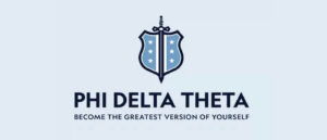
Phi Delta Theta
If you’re looking for proof that 175+ years of history and a modern identity are not mutually exclusive, look to Phi Delta Theta. By leveraging elements of their crest as their logo, the brand harkens back to the fraternal tenets established by their founders. The result is a mark that is immediately identifiable, at any size and across a wide array of contexts. A high-contrast color palette only strengthens the brand’s recognizability. Finally, the tagline, Become the Greatest Version of Yourself, invites individuals to place themselves within the founding ideals Phi Delta Theta continues to deliver on today.
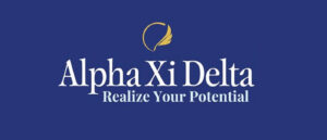
Alpha Xi Delta
Alpha Xi Delta’s brand refresh is a great example of knowing what you have and leaning into it. The quill, a symbol that has represented the sorority since its founding in 1893, was refined in this latest identity rather than reimagined. That decision preserved 130 years of member equity while giving the mark a cleaner, more versatile presence across digital and print applications. Meanwhile, the typography pairing strikes a balance between editorial sophistication and modern readability, reinforcing the brand’s positioning without overpowering it. A refined blue palette keeps the system feeling fresh and unified, while a wide secondary palette offers enough range to flex across formats without losing consistency. The result is a cohesive, confident identity that feels incredibly current.
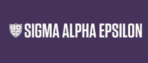
Sigma Alpha Epsilon
Sigma Alpha Epsilon’s shield logo does something most Greek marks don’t attempt. Rather than anchoring around a single symbol, it brings four together. The cross, the lamp of wisdom, the fleur-de-lis and the phoenix each carry their own weight without competing with one another. It’s an homage to the fraternity’s crest that feels equal parts historic and contemporary. That same duality is extended to the font treatments. The sans-serif font in the primary logo reads as modern and striking, while the serif font used for the tagline alludes to the 170+ years of fraternity legacy. The result is a brand that is commanding, steeped in meaning and built to last.
*Indicates an R&R original