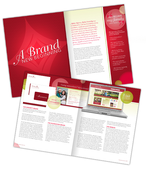
Assisting Alpha Sigma Alpha sorority in establishing an aesthetic that will carry them through the next generation of sisters has been a truly tremendous experience. We immersed ourselves in their history, took part in their present and helped carve a path for their future. In so doing, we designed a great deal of materials for the organization starting with a logo mark and growing to a full suite of materials. Many of you have already clicked through the website, liked them on Facebook and even followed their tweets, but the latest design only just recently hit the “newsstands”.
The Fall 2011 edition of the Phoenix landed in physical mailboxes across the U.S. last week and since then we’ve been flipping through the pages, checking out our handiwork. Not only did we design the new layout of the magazine, but the featured article, “A Brand New Beginning” was designed and written by members of the Rhyme & Reason team. The article itself looks as if it jumped straight off the pages of the website into a printed format, while the copy describes the re-branding process, from start to finish, offering greater insight into each phase of the re-design.
Looking beyond the featured article, you will notice that elements of the new brand are carefully interspersed to create a design that seamlessly integrates into the new aesthetic. The badge emblem, a vital component of the new brand, adds subtle graphic details throughout the pages of the Phoenix, while other design elements have been incorporated into this edition, such as the swirls to create differentiation between pages as well as a bit of youthful whimsy.
Small design additions are nice to see, but what the sisterhood really wanted was a shift towards a more sophisticated and modern piece, with stories that beg to be read. To create such a magazine, we added more white space to allow the words to become the center of attention, design pages specifically to house larger photos and worked with the font sizes and typefaces to make the headlines really pop. As for the stories, the sisterhood is doing a great job of making them happen!
Still want to know more about the Fall 2011 Phoenix, but can’t get your fingers on the actual magazine? Check out the digital version, it’s the same as the printed piece.