Going Greek and other Conference Highlights

I rushed a Sorority!
Okay no I didn’t.
However, I recently attended the Fraternity Communications Association’s annual conference in Atlanta and I feel as if I am now a member of every Greek organization, from the sororities and fraternities to the pharmaceutical and business groups. The two-day conference included non-stop activity from early in the morning till late at night.
As vendors, Karen and I had the opportunity to not only tout Rhyme & Reason Design’s services and capabilities, but we also were allowed to sit in on keynote speeches from the likes of Chic-fil-A corporate executives and Olympic branding specialists and break bread three times a day with the attendees.
There were so many great moments during those 48 hours that I could write a very long-winded account, but that might bore you to tears so instead, I’ll touch on the top three highlights.
The first highlight was setting up our very first vendor booth. I know for many people, setting up and breaking down a booth is old hat and perhaps even the bane of their existence. However, when you see your very first retractable banner go up and the pens carefully placed on the tabletop with your company’s name on them, it’s a welcomed reality check.
The next highlight, was visiting with our current clients face-to-face, a few we never met in-person until the conference. Now don’t get me wrong, I love the digital workspace – email, Skype, text messages and the like keep my world going. Yet, they also make me realize how invaluable in-person communication really is. I can’t tell you how excited I was to read a nametag with a name I recognized solely from emails and phone calls and then meet the young woman with whom it belonged. I already feel like my clients are my friends and I only talk to them on the phone, the ones I get to meet, we might as well exchange BFF charms.
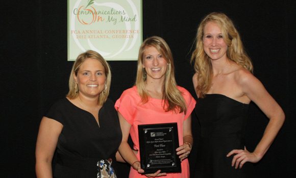
The last highlight is even cooler than our retractable banner and I thought that was cooler than a polar bears toenails. On the last night of the conference there is an awards banquet focused solely on communications and designs. Alpha Sigma Alpha, the sorority that we have assisted throughout their entire rebranding process, was kind enough to enter some of our work for consideration. Good thing they did because our design for their 2011 Annual Report received first place honors! Karen had a love for charts and graphs before, now I think it might have reached epic proportions.
So there you have it, three highlights, two days and one shiny award. Not bad way to enter the world of conferences.


