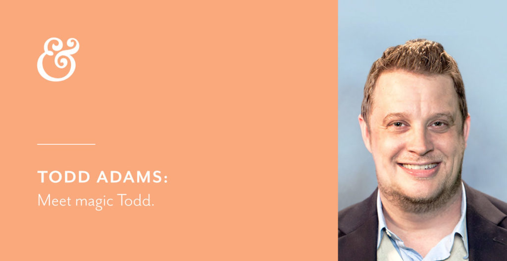
Meet Magic Todd

Our WordPress developer, Todd Adams, is a wizard with websites and even has a few magic tricks outside the office.
SM: How did you get into web development?
TA: I always had a passion for art ever since I was barely walking and dreamed of being a Disney animator when I grew up. In high school, I was introduced to Photoshop, which turned me on to digital design work and I never looked back. I ended up going to college for multimedia design and one of my first jobs after college introduced me to web development. I stayed with multimedia/web design and animation for the first part of my career, and over the years slowly gravitated more and more to the development world.
SM: How do you stay up to date on the latest technology trends?
TA: Web is an industry where everything is constantly changing. Something that was the case five years ago, might not apply today. I’m constantly reading different UX and development articles daily. I’m subscribed to a lot of emails and I just browse a lot of websites to see what other organizations are doing.
SM: Are you a first adapter when it comes to new technology?
TA: No! Early on in my career, I was always itching to use the newest techniques when it came to development, but now after seeing so many latest and greatest frameworks disappear, I’m much more hesitant to immediately adopt. These days I’ll read articles about some amazing new technique, but then read the fine print only to realize it only works on one specific version of a browser, for example. Things like this, while exciting, aren’t useful in the real world since our websites need to be usable by everyone on many different devices and systems. So now I’ll let things settle a bit before adopting. If it’s a CSS or HTML advancement, I’ll wait until all modern browsers offer support, for example. If it’s a new WordPress development tool or method, I’ll wait until it’s been out for at least a few months, if not a year, to make sure the bugs have been ironed out and that it is going to be there for the long haul.
SM: What’s one app or website that annoys you?
TA: There isn’t one app or website specifically, but almost daily I’m annoyed by different apps and websites. One thing in particular that really annoys me is when I click a result from Google to read an article and a pop up suddenly appears and covers the entire article asking me to subscribe to their newsletter. Here I am just trying to read this article, I’ve never been to your website before. How would I know if I want to subscribe to your newsletter, if I’ve yet to even read a piece of content on your site? Another annoyance is when websites have so many ads that you can barely read the content or they make an ad look like part of the content so you click on it accidentally thinking it was part of the article.
SM: What’s the first thing you notice about a website?
TA: The visual design of the page itself is one of the first things to stand out of course. I’m looking at the colors, layout, whitespace that are being used. Are things legible and appealing to the eye? Can I read the text over that photo? Of course, next to content, one of the most important things is user experience. When I’m analyzing a new website, I like to use different personas and navigate the site as that persona. I’m looking to see how easy or hard it is to find information. Can I navigate the site easily to find all the information I need without resorting to the search box? Is the message clear? These are just some of questions I’m asking myself. The website may initially look pretty, but that takes a backseat when it comes to user experience because if you can’t find what you’re looking for, or the content isn’t there, the visual doesn’t matter.
SM: Tell me about a project you’re proud of.
TA: I’m proud of all the projects I’ve worked on. Two projects that stand out to me are the Visit Alpharetta and Alpha Omicron Pi websites. I’m especially proud of those two because the content came together really nicely, the design and typography work really well and each website is really functional for the organization. To this day each of these organizations have done a great job of keeping them up to date and growing them without much intervention from us.
SM: What’s something you want every client you work with to know?
TA: I want every client to know how much thought and planning goes into creating and building a website. R&R has such an in-depth research and immersion process that truly captures the audience that organization is looking for, which allows the development side to build the exact architecture for that user experience. We spend a ton of time thinking about how to build the site, not only for the end users to use, but also so the client has the easiest time making updates and expanding the site without us.
SM: What’s one thing most people don’t know about you?
TA: I was an amateur magician back in the day! I was known as Magic Todd to all my friends in my 20s. It’s something that most of my current friends and coworkers have no idea about as that was such a different point in my life. I still get asked occasionally to “Show us a trick!” from old friends and relatives when I see them. Maybe 2020 will see a slight resurgence of that hobby!

