Aside from a love of design, our clients and the competitive edge that exists in our tech-filled industry, the ladies of R&R share another common love: TRAVEL. This past year we’ve packed our bags (sometimes virtually) a couple times. We headed to Chicago for Alpha Sigma Alpha’s sorority photo shoot, we shaped up on our Mandarin as we designed Blue Sheep Adventure’s identity and website and we threw on our cowboy boots to work with the city of Georgetown, Texas in preparation for their 2011 new brand campaign.
In celebration of my recent nuptials and in light of this love of travel, in October I embarked on a trip to South America with my husband, visiting Peru, Bolivia and Argentina. While I was there, I had a keen eye on the design influences of each culture. Peru boasted their alpaca-filled hats and scarves, Bolivia had their neon, woven textiles but it wasn’t until Argentina, that I really fell in ‘design love’.

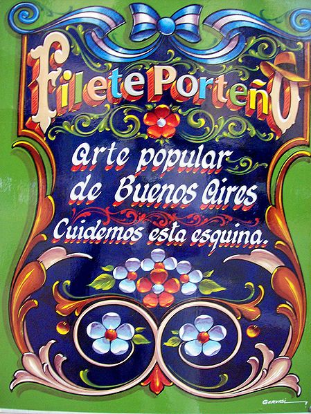
Buenos Aires, already a lively city with its European architecture, delicious wines and asado and sexy tango, is covered in a popular art form called Fileteado. Characterized by bold colors, stylized lines, flowers and dynamic typography, it’s a style reminiscent of US vintage circus posters. The beautiful typography (type gets me every time!) is bold and colorful, curving this way and that. It’s on everything from tango show signs to buildings to the buses and it adds an energetic vibe to the whole city. It wasn’t popular with everyone though. The style was banned in the 1970s by the military government who preferred straight lines and right angles (psychologically and otherwise) and it went underground for a number of years. Today it’s back and a beautiful accent to a vibrant city. Oh, and did I mention it’s 85 degrees and sunny down there? If you haven’t started packing your bags you should. ¿Por que no? (Translation, our trip motto: ‘Why not?’)
