The Ampersand

We admit we may be slightly obsessed with the ampersand. But as it turns out, we aren’t the only ones. It seems our beloved bilingual ligature has been trending toward pop culture stardom, and we think it’s pretty obvious why.
- It’s timeless. The word ampersand — a combination of the phrase “and per se and” — found it’s way into common English sometime in the early 1800’s. However, the symbol itself dates all the way back to Old Roman cursive from 1st Century A.D. We aren’t mathematicians (thank goodness), but twenty centuries is quite a run. And we thought the Rolling Stones have been around a while.
- It’s simple. One of our tasks as creatives is to simplify. We condense notebooks of thoughts into one big idea. We reduce mood boards of images into a single logo. With 140 characters or less, we increase brands’ social media awareness. It only seems appropriate to love a mark so innately simple and self-contained.
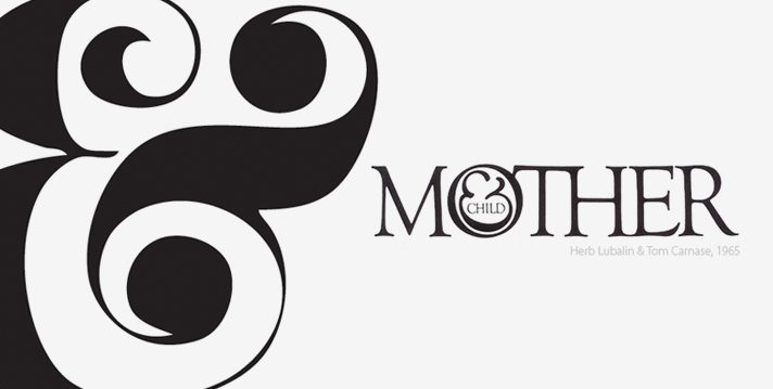
- It’s versatile. Renowned art director and typographer Herb Lubalin illustrated the ampersand’s visual versatility decades ago. Still popular today, the ampersand from his Pistilli Roman typeface is a stark contrast to the one used in his famous “Mother & Child” logo. Whether hastily scrawled or in beautiful script, between two words or standing alone, it always holds its own.
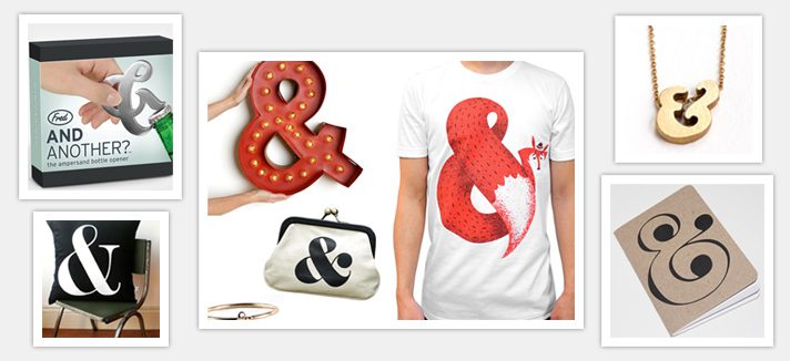
The ampersand has recently developed popularity standing alone, featured on pillows, shirts and notebook covers nation-wide. We actually own an ampersand bottle opener — and yes, it’s as cool as it sounds. We don’t know if this trend has staying power, but regardless, the ampersand will always be relevant to Rhyme & Reason.