The Power of Pantone

Did you know there is a rhyme and reason behind every color? The Pantone Matching System (PMS) was established to create consistent color reproduction across all users. Numbers and names are assigned to each color so manufacturers have the exact recipe to match the color rather than relying on the human eye. Unlike other color methods, like RGB, CMYK and HEX, PMS colors are premixed, creating the most accurate and consistent color match.
 To learn more about the history of Pantone and our bestie Roy G. Biv, read our blog The World of Pantone, Full of Color.
Pantone Psychology
Colors can elicit powerful feelings and a physical reaction. For example, green can make you feel envy while blue has calming characteristics. There is a whole psychology behind color, and smart marketers take full advantage of this. Does simply the sight of the golden arches make you salivate and crave french fries? McDonald’s clever brand color choices can actually stimulate hunger. Check out this article from Art Therapy on Color Psychology: The Emotional Effects of Colors.
Pantone in Fashion
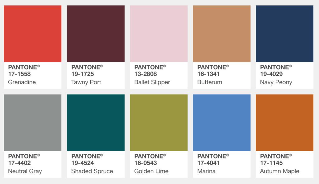
Pantone translates to multiple industries, not just graphic design. The fashion industry forecasts trends based on popular Pantones. Every fall and spring, Pantone releases a Fashion Color Report. Check out the New York Fall 2017 report. This warm palette is accompanied by pops of light Ballet Slipper and Marina, which pair well with autumnal colors. Each color evokes a specific feeling associated with the season, like a “roaring fire on a cool autumn evening” (Butterum) or “sheltering and protective as evergreen trees” (Shaded Spruce).
 Fall Color Palette courtesy of Pantone: http://www.pantone.com/fashion-color-report-fall-2017.
Pantone in Music

Pantone has even crossed over into the music industry. Doves will cry when they see the newest purple Pantone, Love Symbol #2, named after music icon Prince. Purple became Prince’s signature color upon the release of his 1984 award-winning album, Purple Rain. Price is often associated with the color purple and now his legacy will live on through his sharp style, memorable melodies and his custom purple Pantone.
The next time you’re debating the color of your new logo, or even the color to paint your living room walls, think about how it makes you feel. In marketing and advertising, our hope is to elicit an emotion that calls the viewer to action. Something as simple as color can make or break its effectiveness. Choose wisely. Pantones are powerful.

