
Making strides with Back on my Feet
Many of you who know us personally know that we are a fairly active group, from competing in Olympic triathlons to running half marathons. So it should come as no surprise that we were compelled to lend our design chops to a non-profit organization called Back on my Feet.
Back on my Feet’s mission is to promote self-sufficiency of homeless populations by engaging them in running as a means to build confidence, strength and self-esteem. Founded by a young woman, Anne Mahlum (we love do-gooding female entrepreneurs), in Philadelphia back in 2007, her hard work and dedication to the cause has propelled the organization forward enabling her to open chapters across the United States, including Atlanta.
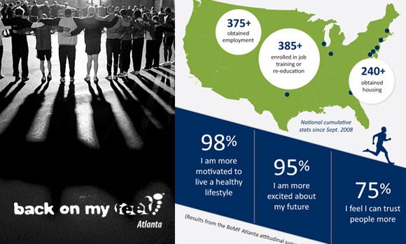
The Atlanta chapter has three teams with more than 45 members and 200 volunteers, or in Back on My Feet terms, non-resident members. Together the teams work to develop a community that empowers individuals to overcome adversity, find and maintain stable housing and employment and restore a sense of self and family. Since its inception the Atlanta chapter, through an attitudinal survey of members, has found that 98% feel more motivated to live a healthy lifestyle, 95% are more excited about their future and 75% feel they can trust more people.
We became aware of the Atlanta chapter through a friend and initially reached out to Simone Walker, the local Director of Communications & Corporate Relations when we noticed a request for design services on their website. To say Simone was excited for our gracious offer of pro bono assistance would be in understatement. We were quickly embraced and set to work on a trifold brochure specifically promoting the Atlanta chapter. Beyond ticking off statistics and promoting the overall brand image of Back on my Feet, Simone wanted to visually express the emotions and camaraderie of the Atlanta chapter. We of course were up for this threefold challenge.

Utilizing the core brand colors of blue and green and maintaining on-brand verbiage, we continued the message of the national organization, while capturing visual impressions of the Atlanta team in poignant black and white photos. I’d say we certainly hit our stride with this design. We’d love for you to check out the brochure, but more importantly you’d make our little hearts skip a beat if you looked into a Back on my Feet chapter in your city.
To learn more about the organization, visit their site: backonmyfeet.org