
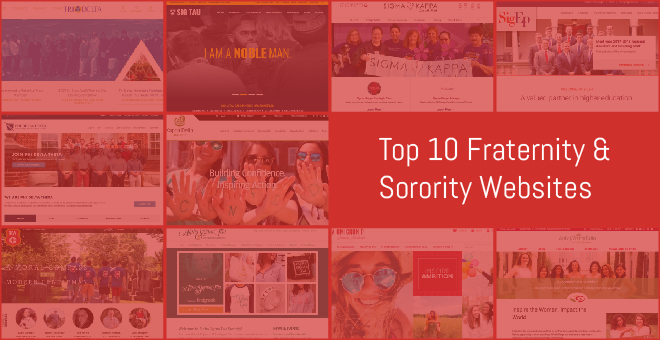
Top 10 Fraternity and Sorority Website Designs
We are in the business of style forecasting and trend setting. Rebrand and technology updates are happening in the fraternity and sorority community, and we’ve had our eyes peeled for the latest and greatest web designs. Within the past couple years, multiple groups have launched sparkly new websites, and we’ve had the pleasure of working on a few of these ourselves. Here is a list of our 10 favorite sites in the Greek community for a little dose of design inspiration. Enjoy!
-
Delta Delta Delta

Tri Delta is a fan-favorite among our Greek clients because of the long scrolling site, condensed navigation and fun geometric patterns. Tri Delta has also taken home two Fraternity Communications Association awards for website design: #1 website in 2016 and #3 in 2017. -
*Alpha Omicron Pi
We may be a little biased on this one, but it’s one of our favorite designs, thanks to its use of some awesome photography! We designed and developed Alpha Omicron Pi’s international site with social media in mind. The large banner collages and feature images create a beautiful and bold homepage to support their new, inspirational brand identity. Check out our case study. -
*Sigma Tau Gamma
The large scrolling banner image on the homepage immediately captures your attention. Not only is the site visually appealing, it’s also easy to navigate. There is a quick jump-to menu along the top, as well as a large footer navigation. Again, another client bias, but they’ve got the web design awards to prove it, including an American Web Design award from Graphic Design USA. Check out our case study. -
Kappa Delta
Ambient video is extremely popular right now, and Kappa Delta does it well. The video reel behind the sorority tagline is the first thing you see when you visit the site. It shows the visitor who they are and communicates the mission of the organization: Building Confidence. Inspiring Action. -
Kappa Alpha Order
We love how the shield is locked in the top left-hand corner of the site as you scroll. Kappa Alpha took home the bronze award for best website at the 2016 Fraternity Communications Association awards. -
Sigma Kappa
Sigma Kappa is a great example of excellent iconography with a little hand-drawn appeal. The website beautifully displays their brand across the entire site, with consistent fonts and colors. -
Sigma Phi Epsilon
The clean lines and large text make Sigma Phi Epsilon’s website another one of our favorites. A major focus on the homepage is fraternity news and events, making it easy to stay up-to-date on all fraternity business. -
*Alpha Gamma Delta
Alpha Gamma Delta is another award-winning Fraternity Communications Association design! In 2017 Alpha Gamma Delta landed second in the best website awards. Another biased opinion, but we love the bright images, accompanied by bold information callouts on the home page. Links to the Foundation, Boutique and Housing Corporation are locked to the bottom of the page above the footer, making it easy to get to these pages no matter where you are within the site. -
Phi Delta Theta
Phi Delta Theta’s website is the epitome of clean: clean lines, simple sans serif fonts and straightforward navigation. This website landed Phi Delta Theta in the No. 1 spot in the 2017 Fraternity Communications Association awards for best website. -
*Alpha Sigma Tau
After creating a fresh brand identity for Alpha Sigma Tau, we carried this aesthetic to a sparkly new website. Throughout the site Alpha Sigma Tau includes callouts to their Emerald Boutique and Herff Jones to promote some of their products and special programs. Check out our case study.


* Indicates an R&R original