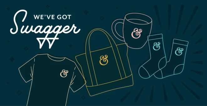
From whimsy to bold, (and everywhere in between) Shea’s got you covered.

From Whimsy to Bold, Shea's got you covered

Whether it’s making snowflakes dance or creating a brand launch video, our Designer Shea O’Connor is an expert at making the traditionally mundane, truly magical. She’s been doodling since daycare and has only gotten stronger; perfecting her signature style and learning to wear all the hats that come with agency life. Ready with her paintbrush and stylus, Shea is one-of-a-kind and ready to do it all.

SM: What is your role at Rhyme & Reason Design?

SO: It’s funny, I feel like I can tell [the design style] of other people more than my own. Lauren is amazing at little details and type stuff and David is really good at coming up with icons for logos. But it’s nice that I am strong in both illustration and typography. I have a really good background in both, so when I can merge both of those with a brand, I think that is really successful. The Discover Dunwoody holiday campaign is a fun example. Lauren designed the logo, but I was able to expand on it and design a couple of illustrations and lay everything out really nicely. I think that’s also what makes me a good motion designer too. There are a lot of people who are amazing at After Effects and I can hang, but I’m not going to say that it’s my forte. I think what makes my work strong is that I’m working on these projects from the beginning— I’m working on storyboards, laying out type and I’m designing. A lot of the time I lean on those strengths, not so much my animation strengths. I know it’s always going to be well-designed. A lot of times, designers will board things out and hand it to a motion designer and say ‘make it wiggle’ versus me working on it from the ground up and even coming up with the style.

SM: How did you come across Rhyme & Reason Design?

SO: I was freelancing at the time and I went to one of the Dribbble (yes, that’s the correct spelling) parties that R&R was hosting to expand my network. Everyone was so nice and after I just kind of said, “It was great to meet you and if you ever want to collaborate on anything let me know, here’s my work.” At the time, they actually needed someone with motion design experience and just general graphic design skills. Sometimes I would do sketches for logos or the first round of designs and just send it to them whenever they were running thin. So, I slowly infiltrated myself into their workplace and once I started doing more motion design projects, they were one of my regular clients and always my favorite because they are really nice and really organized. I got to a point where I was really tired of freelancing because I was working from home and was alone a lot with my cat, so I was just by myself and very isolated and wanted to be working with people again. Luckily, I asked Karen and Scarlett if I could hang around more regularly, but not all the way full-time and they were open to that. We tested it for a couple months just to make sure it worked with the team because not a lot of companies are willing to do that and it actually has worked out and has been really good to have me on board.

SM: How did you start animating and illustrating?

SO: I was introduced to the creative world at a really young age. My grandmother was an artist and she was always doing really cool projects with us, like watercolor painting on the wharf. She was so cool, just a really neat lady. In high school, I’d shut myself up in my room and practice figure drawing from magazines. So that was my intro to drawing and illustration as a kid. I went to school at UGA and majored in graphic design. I got to take traditional art classes like figure drawing, color and composition and painting. But I also got to take graphic design classes where I learned about typography, layout and illustration. That’s where I learned that you could have your own illustration style. So I crafted my own style in college, and then got my first job as a graphic designer at an animation studio. That’s where I started doing more of the motion design work. I had to learn the program After Effects on the job. That was a huge learning curve but it was really helpful and a good skillset to have. I kept refining my illustration skills and learning how to wear different hats for different clients and to figure out which style fits for each client.

SM: Tell me a little more about the differences between animation and illustration?

SO: Animation and illustration are two separate things, but they can be put together. I’d call the type of animation I do motion design, which is a combination of illustration and design and making everything move together seamlessly to tell a brand story. Occasionally I’ll do some character animation. One of the projects we’ve worked on, the Round Rock Chamber animation, that project had figures to animate in it, but for the most part I’m not doing a ton of that. The videos I work on generally include type, footage, photos and illustrations.

SM: Tell me about a project that you’re proud of.

SO: The Round Rock Chamber animation project was really fun to work on. It was really fun to flex those motion design muscles and try something a little more illustrative. I really liked that one. I’m also having a lot of fun with the Discover Dunwoody holiday project we’re working on right now. I think it’s a fun and clever campaign that has a lot of personality, but it’s very refined at the same time. It’s a great fitting project for us and any part of it I get to work on is exciting. Our Greek brands like Gamma Phi Beta and Alpha Delta Pi are really nice too. I like the brand videos we’ve been doing for them — I think it’s a really smart add on. I really like everything that I make! I would never put anything out into the world that I’m not proud of.

SM: Where do you draw inspiration from when creating a new design?

SO: A lot of times I’ll look and see what competitors are doing. Most of our clients include competitors in their creative briefs, so I’ll look at those and think ‘what would I do better.’ There’s always Pinterest and Dribbble too, so it’s nice to see how other designers are solving problems. Usually what I end up doing is making a mash up of everything I’ve seen, so trying to get glimmers of inspiration from all over the map and then pushing it together to make something original.

SM: How do you start a new design from a blank canvas?

SO: The creative briefs that we do are super helpful. Reading about the client and learning about the tone that they want makes it easier to match images with the words they’re describing. If they use ‘energetic,’ I know I can use more vibrant colors. Or if they use ‘playful,’ I can do something really fun and funky with the type. So, reading is always good. Right now, I’m working on Covington/Newton County so I’m looking at how other successful communities’ brands are doing it well. I’m also always sketching or writing down words that pop into my head.

SM: Where do you prefer to sketch – computer or paper?

SO: I think now I like to sketch on my iPad more than anything just because it’s quick, clean and organized. And I can hit undo, which is nice! The workflow is a little stronger. But, sometimes it really does help if you don’t want something to feel precious at all, to just do it with a cheap pencil and paper so it feels less scary. It’s nice to be able to sit in one of our comfy blue chairs and be able to feel untethered from the computer.

SM: Is there a certain design style or project you’ve struggled with?

SO: Not so much anymore, it just comes back to being able to wear those different hats. Whimsy is definitely my happy place and where I thrive, but I can pivot and make a much more masculine project. Like Delta Tau Delta, I made a video for them that you would have never known I did. It kept making me giggle because it was very much like a “we are strong men” kind of tone and I’m sitting there wearing a yellow, purple and pink striped skirt.  So, it’s not so much of a challenge, it’s more fun to be able to try a million different styles. To be a chameleon I guess!

SM: GIF or static ad? When is the best and worst to use each?

SO: Really what it comes down to is file size. The smaller the file size, the more limited you are with your animation. At that point, you get more bang for your buck by having a still design that’s really nice quality rather than something else that looks a little clunky. But, if you can have a slightly larger size, usually like 150kb or more, then you can do a few more fun things. It just depends on what the client is trying to say, but if the file size is small and they just want photography, then you should just make a really well-thought-out still.